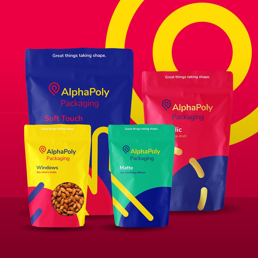
At AlphaPoly, we know that packaging is a powerful tool for shaping brand identity and driving consumer recognition. Let’s explore some standout case studies from the US market where innovative packaging designs have significantly boosted brand success.
Method – Clean and Green
Method, a brand known for its eco-friendly cleaning products, has leveraged packaging to communicate its commitment to sustainability and modern design. Method’s sleek, colourful bottles stand out on store shelves, and their use of post-consumer recycled plastics resonates with environmentally conscious consumers. The brand’s innovative designs, such as the teardrop-shaped hand soap bottle, not only enhance aesthetic appeal but also reflect the company’s values. This alignment between packaging and brand ethos has helped Method carve out a unique niche in the competitive cleaning products market.

RXBAR – Transparency in Every Bite
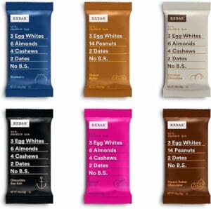
RXBAR revolutionized the health food market with its straightforward packaging that lists core ingredients prominently on the front. This design choice demonstrates the brand’s commitment to transparency and simplicity. By putting ingredients like egg whites, almonds, and dates front and center, RXBAR builds trust with health-conscious consumers. The bold, clean typography and minimalist design help the product stand out in a crowded market. This clear and honest approach to packaging has significantly contributed to RXBAR’s rapid growth and success.

Chobani – Storytelling Through Design
Chobani’s packaging design tells a story of authenticity and quality. The brand’s use of earthy colours, rustic fonts, and artistic imagery reflects its commitment to natural ingredients and wholesome products. The packaging often includes illustrations that evoke a sense of farm freshness and simplicity. This storytelling approach differentiates Chobani from other yogurt brands and builds an emotional connection with consumers who value authenticity and transparency in their food choices.

Ben & Jerry’s – Fun and Social Responsibility
Ben & Jerry’s uses packaging to tell its customers what they’re all about. The whimsical designs, vibrant colours, and playful fonts reflect the brand’s personality and commitment to making a positive impact. The packaging often includes messages about the company’s social initiatives and values, such as fair trade and environmental sustainability, aligning packaging with their mission and creating a deeper connection with consumers.

Let’s Get You Recognized
Here at AlphaPoly, we’re passionate about helping brands find similar success. Whether you’re aiming for iconic simplicity, sustainable elegance, or bold transparency, we have the expertise to bring your vision to life.
Let’s work together to create packaging that not only stands out on the shelf but also resonates with your customers, building lasting connections and driving brand loyalty.
